services
Brand Identity
Website Design
WordPress Development
Brand Theme
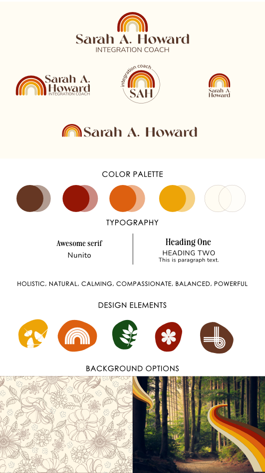
Colors: An earthy color palette of chocolate brown, mustard yellow, burnt rust, and cream.
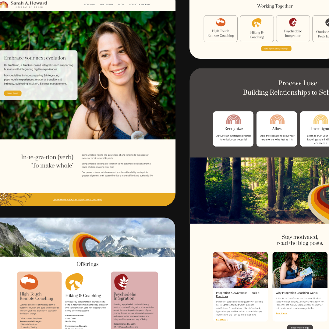
I think alternating between bright and neutral backgrounds helps it from being too overwhelming and busy
Imagery:
Wildflowers: beautiful yet sturdy, adapting to their environments. This metaphor connects to helping clients flexibly grow through challenges.
Rainbows: Rainbows represent the full spectrum of human emotion and experience.
Coaches guide clients through all of life’s ups and downs.
Trails: Exploring trails is a metaphor for the coaching path of self-discovery.
Twisty trails represent the indirect coaching journey with insights revealed slowly.
Vibe: Wise yet warm, welcoming Empowering people to embrace their inner magic on the path of self-discovery. Worldly and elevated. Blending a creative spirit with an intellectual mindset.
In progress style board


“Tina has made rebranding my website easy and fun. She really cares about how you want your customers to feel when they visit your site. She does a great job of integrating personal design elements, presenting information clearly, and ensuring consistency throughout. She went above and beyond to ensure my logo was exactly what I was looking for. I feel way more professional and confident as I release my new offering to the world after working with Tina. Thank you!”

